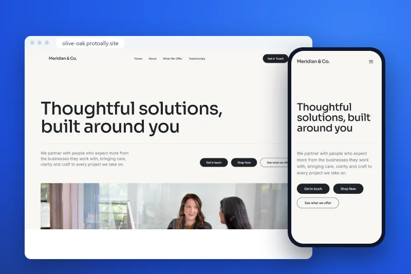
Responsive Website Development Services for a Fast MVP
Read Article

You have the idea. Maybe it has been living in your notes app for months, or you have sketched it on sticky notes during lunch breaks. But every time you explain it to someone (a potential investor, a co-founder, a friend who "knows tech") it still sounds vague. The idea is not bad. It just has not been shaped into something people can see, try or fund.
This is one of the most frustrating stages of building a startup. You know what problem you are solving, but not how to turn that into a clear product plan. Without one, getting traction, let alone funding, feels like pushing a boulder uphill.
The good news is that responsive website development has become one of the quickest and most affordable ways to go from concept to credibility. You do not need a technical co-founder or a six-figure budget to show investors something real. You need a clear plan and a site that works on every screen.
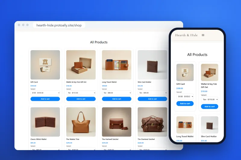
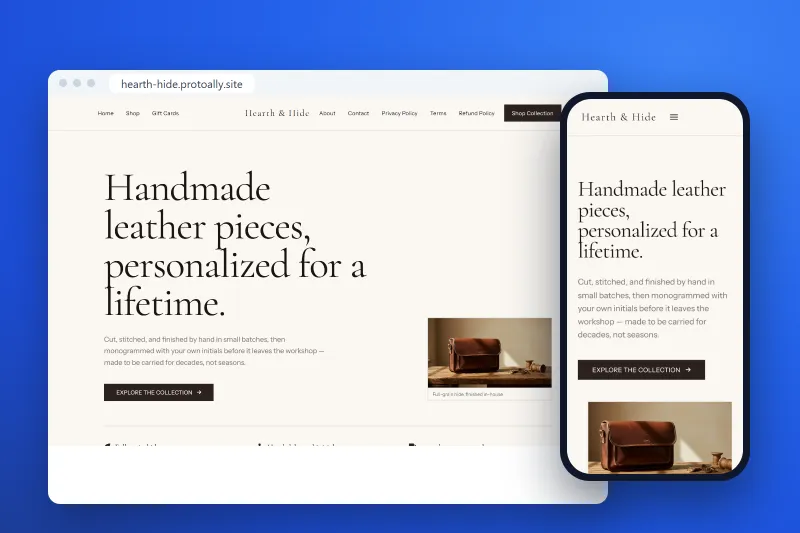
Most people hear "responsive website development" and think of a site that looks fine on mobile. That is part of it. For early-stage founders it means more: a web presence that works on every device, adapts to any screen and explains your product to whoever lands on it.
More than half of web traffic now comes from phones. If your first impression (a landing page, an MVP or a product demo) does not work on a small screen, many visitors will leave before they read a word.
If you want the technical side of how responsive design works, Coursera's guide to responsive web design explains fluid grids and CSS media queries in plain language.
Beyond the technical side, a well-built responsive site makes your idea feel real. It tells investors, early users and partners that you are serious and organized.
Here is what most founder guides skip: the gap between "I have an idea" and "I have something to show" is about more than code. It is a clarity problem.
Investors do not just fund ideas. They fund founders who show they understand the problem, the user and the solution. Before you design a single screen, you should be able to answer these questions:
Most founders can answer these out loud but struggle to turn the answers into a structured plan. Without that structure, building the site becomes guesswork, and you end up with pages that look nice but do not say the right things to the right people.
The first step is getting your idea out of your head and into a format others can judge. A good plan usually includes four things.
A clear problem statement. Not "people struggle with X" but "people in situation Y feel pain Z, and current solutions fail because of W." The more specific, the better.
A defined user path. What does your ideal user do when they first arrive? What action do you want them to take? Where do they go next? Mapping this roughly is essential before designing any page.
A feature priority list. Not everything you want belongs in your first version. Decide which pages and features prove your concept and which can come later.
A visual structure. A simple sketch of what goes where is enough. It forces you to decide on hierarchy and flow before you are locked into a design.
Once your product structure is clear, you can build something that helps you raise money, not just something that looks good.
Your landing page is the pitch before the pitch. It should answer three questions in the first ten seconds: what is this, who is it for, and why should I care? Every section, from the headline to the social proof, should connect back to them. A responsive site makes sure that story reads well on a 27-inch monitor or a cracked phone screen in a taxi.
One of the biggest mistakes founders make is jumping from idea straight to full design. A quick sketch lets you test the flow from one page to the next, the placement of calls to action and the structure of your key messages without spending time or money on visuals that may change. Figma, Balsamiq or pen and paper all work. The goal is logic, not beauty.
Your website is often the first thing an investor opens after hearing your pitch, so it works as proof that the idea is real. Put a clear problem and solution on your homepage. Show traction if you have it, such as signups, waitlist numbers or testimonials. Make the product easy to understand in under two minutes, and check that it works on their phone, because that is probably where they will look.
Founders no longer have to choose between an expensive agency and learning to code. Website builders now make it possible to launch a working site much faster than before.
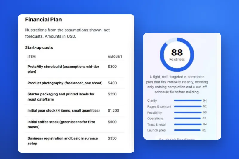
ProtoAlly starts with the plan. Its AI Blueprint writes a plan from your idea, covering who it is for, the user journeys, features, pages, brand, costs and a launch checklist, with an estimate to build it yourself or a mentor's price and timeline. The AI website builder then makes a working site, and you can fine-tune it in the visual and AI editor. Publishing is one click, on a free protoally.site address or your own domain with a paid plan.
For things the builder cannot do yet, like user logins and app data, you can book a human mentor. Mentors also help with SEO, ads and growth. If you feel stuck trying to figure things out, you can reach out to a mentor here.
You do not need everything figured out before you start, but you do need some structure. Here is what works.
Talk to five potential users before you design anything. Ask them to describe the problem in their own words. Their language will improve your copy, your feature priorities and your positioning.
Match the build to your stage. If you are testing an idea, a landing page with a waitlist form is enough. If you are raising a pre-seed round, you probably need a working prototype or MVP.
Do not skip mobile testing. Design for the phone first, then scale up to desktop. It forces you to prioritize what matters most.
Get feedback early and often. Share your sketches and early pages with people outside your inner circle. You want honest reactions, not validation.
Write down your product decisions. Keep notes on why you made each choice. They help when you onboard team members, explain the product to investors and stay focused as you grow.
The founders who raise money, attract co-founders and build products people want are not necessarily the most technical. They are the clearest. They can explain their product, show how it works and say why it matters, and their responsive website development reflects that clarity at every step.
If you have a great idea but are struggling to make it fundable, do not rush into building. Slow down long enough to write the plan that makes everything else faster. Start with the problem, map the user path, sketch the pages, then build the site responsively, because your users and your investors are both on their phones.
The question is not whether you can do it. It is being willing to start.

Written by the ProtoAlly team and mentors, who help founders plan, build, launch and grow web apps with AI and expert guidance.
One short, practical idea for your site each week, plus ProtoAlly news.
AI Website Builder with Visual Editor
Start building with AI in minutes, customize every detail with our visual editor, and get expert help whenever you need it.
Join the founders and creators building launch-ready products on ProtoAlly.